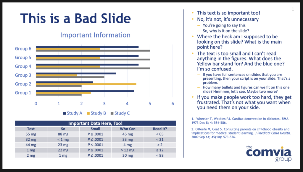
When I coach people on creating powerful presentations, one of the first things we work on is their PowerPoint slides. Because much of the business world uses PowerPoint to share data among teams, it’s natural to want to put every data point and every clarifying message on a slide to ensure the reader will understand it—even if you’re not there to explain it.
But when you are presenting your slides, you are there to explain them. Your approach should be different. Your sides should support you. They are not meant to replace you! You want your audience to listen to you while you are leading them through your presentation. You want them to stay in the moment with you every step of the way.
When you throw up a slide that is overloaded with text or data, guess what? Your audience tunes you out, and starts to read the slide. Here are some tips for avoiding slide overload.
- Make them more visual. If you can use a chart, graph, or image instead of text bullets, do so.
- Use builds to reveal information. Instead of putting up a slide with 6 bullets that you will cover in the next 30 seconds, reveal each bullet as the words come out of your mouth. And remember, the bullets should be short. Your voice will provide the details; the bullets are simply visual markers for the audience.
- Cut, cut, and then cut again. Each time you rehearse your presentation, you should be looking for opportunities to reduce the amount of content on your slides. The less cluttered they are, the faster your audience can process them.
- Tell me where to look. When you do have to show a slide that is complex, talk your audience through where they should focus their attention. Use builds or highlight boxes that signal visually what part of the slide you’re currently referring to. This is especially important for scientific slides that include large amounts of data presented in a table or in a complex graphic. Highlight the area that underscores your point, so the audience’s eyes go right to it.
Ask yourself questions about your sides as you prepare your talk, like: “Do I really need a slide for this?” and “What’s the point of this slide?” That will force you to look for opportunities to make them more concise and visually engaging.
Slides that are supportive of your narrative, and are concise and well designed, will make your presentation shine.

